Boston Light & Sound Brand Identity
DESIGN, CREATIVE STRATEGY + RESEARCH, TAGLINE DEVELOPMENT, PRINT MANAGEMENT
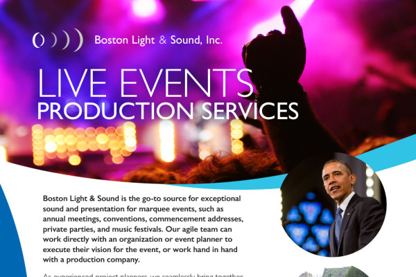
When Boston Light & Sound (BL&S) approached Merry Perry Design, the specialty sound and projection company had decades of experience and a devoted customer base, but was missing a strong visual presence. Merry Perry Design helped BL&S clarify its messaging and realign its visual brand with its stellar reputation. The updated logo features clean, modern details that convey the concept of making something small big, be it sound, film or digital image. A recently updated tagline – “Presenting Visionary Sight & Sound” – clarifies the firm’s positioning: expertise to present creative vision in any form.
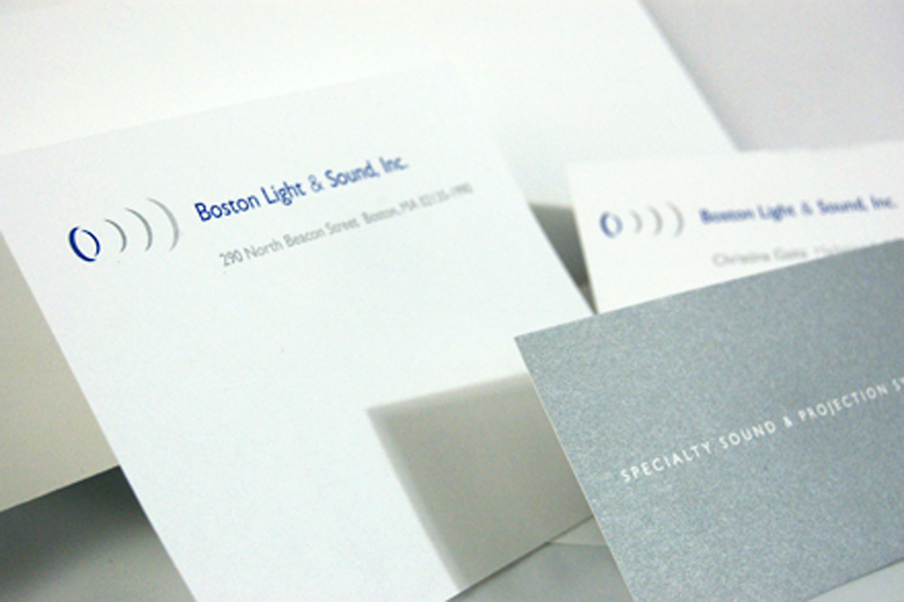
Stationery suite
A new identity and stationery suite reflect the company’s worldwide reputation as the best in the business. The identity’s outward motion alludes to BL&S’s ability to take something small – a digital image, film or sound – and amplify it. BL&S’s stationery suite employs hits of metallic silver ink on uncoated paper stock to reinforce a subtle “technological flavor.”
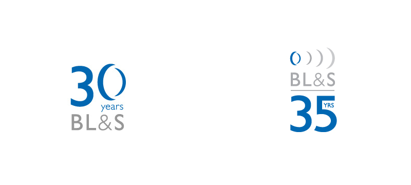
Anniversary logos
Taking a cue from the standard Boston Light & Sound logo, the 30th Anniversary emblem makes use of the lens/speaker element as the zero in “30.” The specialty sound and projection company played up the milestone throughout their 30th year and again in a re-imagined form for their 35th by featuring the special logos on blsi.com, in emails and in printed correspondence.
- Client Boston Light & Sound
- Date August 11, 2015
- Tags >Branding, Arts, Business


